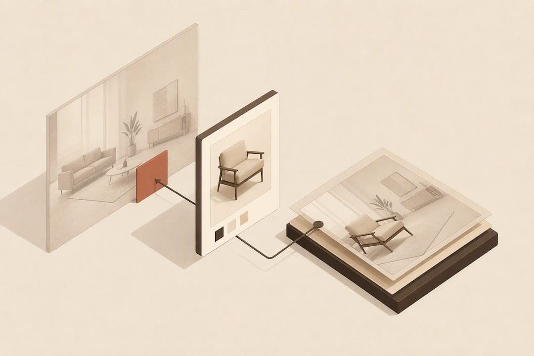
Yes, with conditions. A room-photo upload preview earns its place on furniture product pages because it directly answers the shopper's biggest hesitation: will this actually work in my space? The catch is data hygiene and mobile placement. Get standardised SKU dimensions and gallery visibility right first, and a tool like AI Furniture Solutions can turn a JPEG upload into a composited preview in roughly 30 seconds, without an app.
TL;DR:
- Placing the upload control inline with the main image gallery boosts adoption and gives shoppers a quick way to visualize fit without scrolling.
- Standardized SKU dimensions and consistent product photography are essential to produce accurate, trustworthy composited room previews.
- Previews should render within 30 seconds on mobile to prevent abandonment and maximize user engagement during the critical decision-making window.
- Using a small, free preview quota on high-ticket SKUs allows testing of placement, speed, and catalog data quality before scaling or committing budget.
- Room-photo previews mainly confirm fit after browsing, reducing size or style surprises that could lead to returns, but do not replace standard product images.
Table of Contents
- Why room-photo uploads matter for furniture retail
- Practical UX checklist: what the upload flow and gallery must provide
- Implementation pitfalls and data hygiene to fix before launch
- How to measure success: KPIs, A/B tests and operational metrics
- Rollout priorities and a short tactical roadmap
- How AI Furniture Solutions fits into a low-risk pilot
- Sources
- FAQ
Why room-photo uploads matter for furniture retail
Furniture shoppers hesitate for one reason above all others: they cannot picture the sofa in their actual room. That uncertainty is measurable. A 2026 Frontiers in Communication study found that augmented reality tools mediate the effect of return policies, reducing return behaviour by giving shoppers a clearer basis for evaluating fit before they buy. An academic thesis from Jönköping University (HJ Dalarna) reached a related conclusion from a different angle: interactivity and perceived ease of use, not novelty or feature count, are what predict shopper satisfaction with interactive product visualisation tools.
None of that means a preview widget replaces good photography. Baymard's usability testing found that most furniture shoppers go straight to standard product images first, and treat "view in room" features as a supplement rather than a primary decision tool. That reframes the job of a room-photo upload: it is not there to carry the sale on its own.
Where it earns its keep is later in the journey, after the shopper has scanned the main gallery and started weighing fit and proportion, and before they reach checkout with lingering doubt. That is the moment a composited preview either confirms the purchase or surfaces a mismatch worth catching early, before it becomes a return.
- Reduces one specific type of doubt: spatial fit, not price or quality
- Works best as a supplement to strong photography, not a replacement for it
- Adds the most value between browsing and checkout, when hesitation peaks
Practical UX checklist: what the upload flow and gallery must provide
Building the feature is the easy part. Getting shoppers to actually use it is where most rollouts stall. Baymard's research is blunt on this point: placing the preview control near the main image gallery drives discoverability, and burying it in a tab or accordion kills adoption before it starts.
Here is the sequence worth working through before launch:
- Placement first. Integrate the upload trigger into the primary image gallery, not a secondary tab, and keep it visible without scrolling on mobile.
- Image roles. Pair the room composite with a scale image, a dimension graphic, and at least one material close-up. Baymard's 2026 quantitative furniture UX research found written dimensions matter to 49% of shoppers and dimension images to 42%, both ahead of many other content types on a furniture PDP.
- Upload mechanics. Accept common formats (JPEG, PNG, HEIC), cap file size sensibly, auto-orient images shot on mobile, and offer a simple crop step so shoppers do not have to reshoot a photo.
- Feedback and timing. Show a clear progress state, a timeout message if something stalls, and aim for a preview latency close to 30 seconds. Longer waits on mobile correlate with people abandoning the flow.
- Accessibility. Use plain-language labels, avoid gestures that require pinch-zoom precision, and make sure the upload control works with keyboard navigation and screen readers.
- Trust and privacy. Add a short line explaining how the photo will be used, avoid vague consent language, and run basic automated photo moderation on anything a stranger's camera roll might contain.
Pro Tip: Don't make the upload step feel like a form. A single tap to open the camera or file picker, with drag-and-drop as a fallback on desktop, beats any multi-field upload wizard for conversion.
Implementation pitfalls and data hygiene to fix before launch
Most failed pilots trace back to the catalogue, not the widget. If SKU dimensions are inconsistent or missing across variants, the composited preview will render at the wrong scale, and a wrong-looking sofa erodes trust faster than no preview at all. Standardising width, depth, and height data, and mapping it correctly to the rendered image, has to happen before the feature goes live, not after shoppers start complaining.
Photo orientation and lighting matter more than most teams expect. Product shots taken at inconsistent angles or under mismatched lighting break the compositing engine's assumptions, producing previews that look pasted in rather than real.
Placement failures are just as common as data failures. Baymard's testing again points to the same issue: teams that tuck the preview control into a secondary menu see far lower usage than teams that put it inline with the gallery, regardless of how good the underlying technology is.
A few things worth checking before any broad rollout:
- Confirm every SKU variant has accurate, standardised dimensions, not just the parent product
- Audit product photography for consistent angle, crop, and lighting across the catalogue
- Test the preview against a range of real room photos, not just studio-lit samples
- Make sure renders never overstate or understate size or material texture, since inaccurate previews create the returns they are meant to prevent
- Put automated image moderation in place before shoppers can upload personal photos at scale
How to measure success: KPIs, A/B tests and operational metrics
Treat the first few weeks as a controlled experiment, not a launch. The clearest signal comes from combining adoption data with returns data at the SKU level, since a preview that gets used but doesn't change return rates is telling you something different from one that barely gets touched at all.
| Metric type | What to track | Why it matters |
|---|---|---|
| Adoption | Preview completion rate per PDP visit | Shows whether placement and speed are working |
| Conversion | Purchase rate: preview users vs non-users | Isolates the feature's effect on buying confidence |
| Returns | Return rate delta for SKUs used in previews | Tests the core promise: fewer size or style surprises |
| Operations | Preview latency, error rate, cost per preview | Keeps the pilot financially and technically sane |
Worth testing head to head: gallery-visible placement versus a hidden or secondary-menu version, and a faster low-fidelity render versus a slower high-quality one, to see which trade-off shoppers actually tolerate. Running the pilot on high-ticket SKUs first, where a return costs the most, gives the clearest read on ROI. A free allowance of previews is often sufficient to gather early adoption and conversion signals on a handful of bestsellers before committing to a paid rollout.
Rollout priorities and a short tactical roadmap
Start narrow. Pick five to ten high-ticket SKUs where a wrong-size return actually hurts your margin, and put the upload control directly in the image gallery, not in a drawer nobody opens. Instrument analytics at the SKU level from day one, because average conversion figures hide exactly the pattern you need: whether previews change buying behaviour on the products where it matters most.

Run a real pilot before you scale anything. The free 500-preview allowance most vendors offer is enough to test placement, latency, and catalogue data quality without committing budget. Expect the first version to be wrong in small ways, in dimension data, in photo lighting, in copy. Fix those before rolling out further.
Do not treat the preview as a standalone feature. It works best stacked with dimension graphics and customer photos, which shoppers already trust more on their own. A composite is one input into a buying decision, not the whole argument.
— Michael
How AI Furniture Solutions fits into a low-risk pilot
This solution is built around one specific job: turning a shopper's room photo and existing product JPEGs into a realistic composite, without asking anyone to download an app or your team to build 3D models. Previews render quickly enough to keep mobile shoppers engaged.
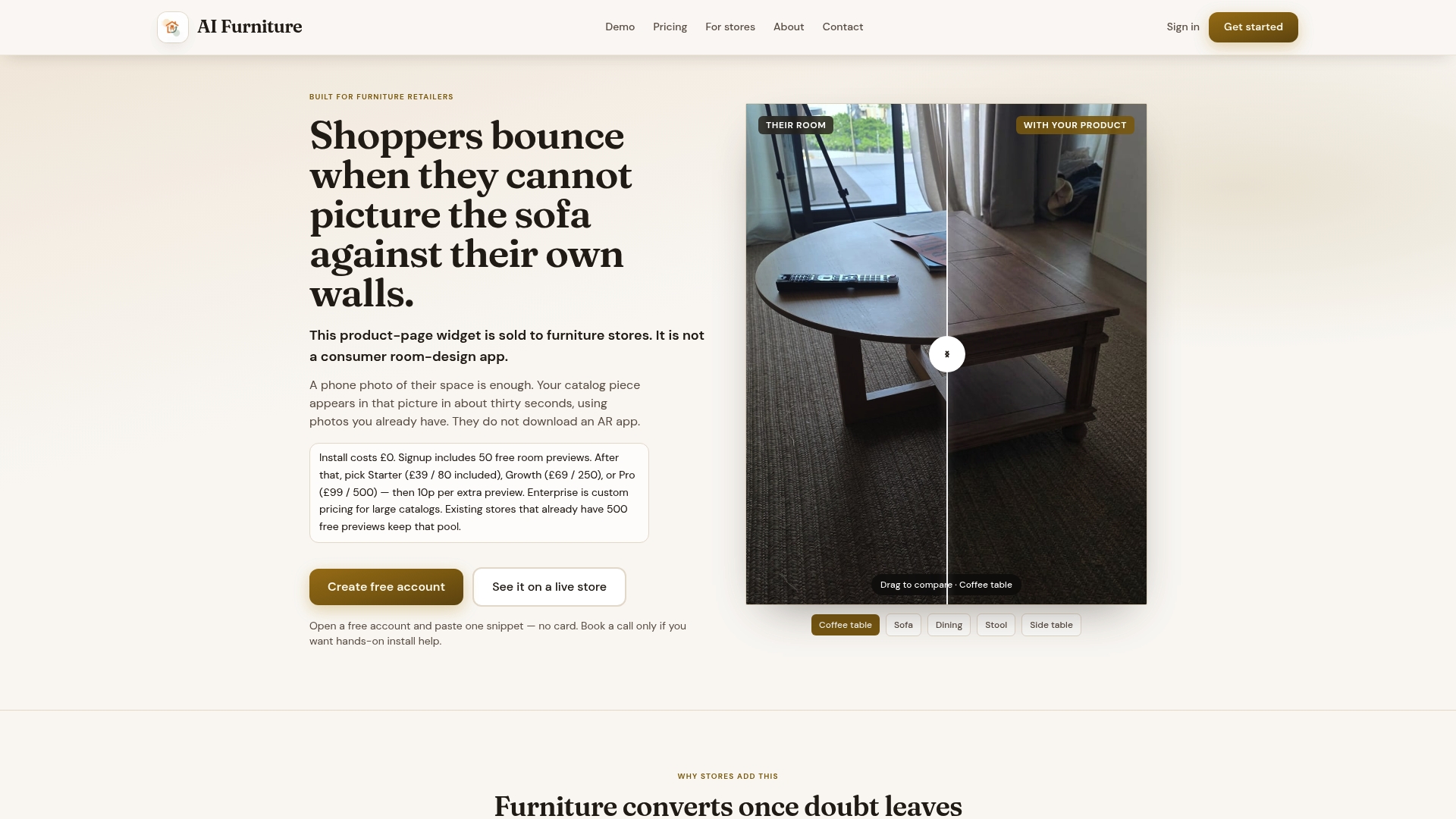
The trial structure matches the pilot approach described above: free previews to test on your actual product pages before any cost kicks in, integrating with popular ecommerce platforms or a custom storefront. If you want to see it against your own catalogue rather than a demo, run a merchant bake-off on your existing photos or compare the approach directly against 3D modelling and photography workflows. For Shopify stores specifically, the furniture visualiser integration walks through setup. When you are ready to move past testing, book a launch call to plan the rollout against your highest-return SKUs first.
Sources
Baymard's furniture UX testing covers gallery placement and photo priorities. The HJ Dalarna thesis examines satisfaction drivers for interactive visualisation. The 2026 Frontiers study links AR to return reduction. Baymard's quantitative insights quantify dimension content demand. Automated Commerce reports industry-wide conversion and return trends.
- Furniture UX: Deprioritize “View in Room” – Baymard
- The influence of interactive product visualisation on customer satisfaction (HJ Dalarna thesis)
- Augmented reality as a mediator between return policies and preventing return behaviour — Frontiers in Communication
FAQ
Does a room-photo preview replace standard product photography?
No. Baymard's testing shows most shoppers still go to standard product images first, so a preview should supplement the gallery rather than replace it.
What preview speed should we target for mobile shoppers?
Aim for previews rendering in around 30 seconds. Longer waits on mobile tend to increase drop-off before the shopper ever sees the composite.
Where should the upload control sit on the product page?
Inline with the main image gallery, visible without scrolling on mobile. Burying it in a secondary tab measurably reduces how often shoppers use it.
What catalogue data needs fixing before launch?
Standardised SKU dimensions across every variant, plus consistent product photo angle and lighting, since mismatched data produces previews that render at the wrong scale.
How can we trial this without committing budget upfront?
A free allowance, such as the 500 previews Aifurniture offers, lets you test placement, latency, and catalogue readiness on a handful of SKUs before paying for anything.