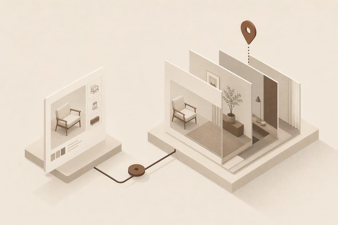
The fastest way to increase furniture conversion is to pair accurate, annotated dimensions with a low-friction room-preview tool that lets shoppers see the item in their own space, no app required. Together these close the two biggest gaps in furniture ecommerce: not knowing if it fits, and not knowing what it will actually look like at home. Retailers testing this combination typically see fewer size-related returns and stronger add-to-cart rates within weeks, and a trial run using free preview credits is enough to prove it before committing budget.
TL;DR:
- Pairing accurate, annotated dimensions with room-preview tools reduces size-related returns by confirming fit and appearance before purchase.
- Using existing JPEGs for photo compositing is the fastest way to implement a room-preview, with no app download required, ideal for testing high-traffic SKUs.
- Civilian shopper confidence increases by 67% after visualisation tools, with conversion gains evident even in short pilot periods of two to four weeks.
- Visualisation efforts should start small with 20 to 50 SKUs and scale based on data around return rates and engagement, avoiding premature investment in complex 3D assets.
- Key KPIs include conversion rate, add-to-cart rate, preview engagement, and return rate split by preview use, with A/B testing recommended for accurate attribution.
Table of Contents
- Five product-page fixes that actually move conversion
- Photo compositing vs 3D models vs web AR: which fits your catalogue
- How do you pilot a room preview without a big engineering project?
- Measuring the lift: KPIs, A/B tests and ROI
- Who's actually hesitating on your product page
- Writing product descriptions that sell and rank
- Turning reviews into a genuine trust signal
- Getting the mobile experience right
- Cross-selling without derailing the sale
- Where AR goes next, beyond a basic preview
- Start with measurement, not the shiniest tool
- Try the room-preview widget before you commit to anything bigger
- Sources
- FAQ
Five product-page fixes that actually move conversion
Most furniture product pages lose buyers to doubt, not disinterest. Shoppers add an item to their cart, then hesitate over whether the sofa will swallow the room or whether the oak finish is really that orange. Fixing that doubt is a photography and information-architecture problem before it's a technology problem. Here's the order that gets results fastest.
- Annotated dimension image. Show overall width, depth and height plus functional dimensions (seat height, arm width, clearance under a console) in both centimetres and inches, with a person or common object for scale. This single fix targets the most preventable cause of furniture returns: shoppers misjudging scale from a plain spec table.
- High-fidelity, honest visuals. Offer 4K zoom and close-up shots of texture, grain and weave. Richer tactile visual detail measurably increases purchase intention through a sense of immersion, and it helps most with buyers who struggle to picture texture in their head. Skip heavy retouching. Colour that looks different on arrival is a returns driver in its own right.
- A room-preview widget, placed above the fold. Whether it's photo compositing or web AR, a tool that lets shoppers drop the product into their own room belongs near the primary product image, not buried in a tab.
- Delivery and assembly facts, visible before checkout. State lead time, whether assembly or white-glove delivery is included, and who covers return freight on large items. Buyers who don't know this before ordering are more likely to cancel or return.
- Trust signals tied to the exact item. Customer photos in reviews, an accurate cart thumbnail showing the chosen fabric or finish, and verified buyer imagery all reduce the "this isn't what I ordered" feeling that drives disputes.
Pro Tip: Run the dimension image and the room-preview widget as a pair, not separately. Shoppers who confirm both fit and look before buying are far less likely to open a return case over "it's smaller than I expected" or "it doesn't suit the room."
None of this requires new photography equipment or a 3D pipeline. It requires treating the product page as an answer to the three questions every furniture shopper silently asks: will it fit, will it look right, and what happens if I'm wrong.
Photo compositing vs 3D models vs web AR: which fits your catalogue
Retailers usually default to whichever visualisation method their agency pitched first, rather than the one that matches their catalogue and timeline. The three main approaches carry genuinely different trade-offs.
- Photo compositing works from the JPEGs a retailer already has. A shopper uploads a room photo, the product is superimposed, and there's no app to download. This is the fastest to deploy across a large catalogue because it skips asset creation entirely.
- 3D models deliver the highest fidelity and the most accurate scale representation, since the object is genuinely three-dimensional and can be viewed from any angle. The cost is real: someone has to model, texture and maintain each SKU, which is expensive across a catalogue running into the thousands.
- Web-native AR sits between the two. It gives spatial placement without a native app, but it still generally needs 3D assets behind it, so the deployment cost mirrors the 3D route more than the photo route.
App-based AR carries a structural disadvantage that has nothing to do with rendering quality: shoppers simply won't download an app to check if a chair fits, so uptake stays low regardless of how good the technology is. Web-native tools, compositing included, avoid that friction entirely.
The research backs urgency here. 62% of consumers find it hard to visualise furniture in their own home, and 67% report feeling more confident in their purchase after using a visualisation tool. Retailers deploying interactive 3D and AR report meaningful conversion and average order value gains, which suggests the ceiling on this category is high regardless of which method a retailer starts with.
A sensible decision path: pilot photo compositing on your highest-return, highest-traffic SKUs first, since it's cheapest to test and fastest to read results from. Move specific product lines to 3D or web AR only where scale and margin justify the ongoing asset cost, such as modular sofas or made-to-order pieces where configuration accuracy really matters.
How do you pilot a room preview without a big engineering project?
You don't need a quarter-long roadmap item to test this. A focused pilot can run in a few weeks if you scope it tightly.
- Pick 20 to 50 pilot SKUs. Prioritise items with high average order value, a high return rate, or heavy traffic. Sorting SKUs by return frequency multiplied by average freight cost quickly surfaces where a fix pays for itself fastest.
- Check your existing catalogue images. Most photo-compositing tools work directly from the JPEGs you already have, so the main prep is confirming resolution and a clean, front-facing angle. Build or update annotated dimension images for the same SKU list at the same time.
- Place the widget above the fold with a plain call to action such as "Try it in your room," a one-line privacy note about the photo upload, and a clear statement that no app download is needed. That last line alone removes a real hesitation for a lot of shoppers.
- Route the data. Send preview engagement analytics to your customer service and fulfilment teams, and tag orders where the shopper used the preview before buying. That tag becomes the backbone of your returns comparison later.
- Use the free trial to prove it before paying. A pilot using Aifurniture's room-preview widget can run on 500 free previews, which is generally enough volume to read a directional signal on conversion before you commit to a paid plan. Set your acceptance criteria in advance, such as a defined lift in add-to-cart rate or a defined drop in size-related returns, so the pilot has a clear pass or fail line rather than a vague "let's see."
Pro Tip: Publish doorway width and stairwell turn constraints alongside your standard dimensions on large items. It's a small addition that catches a specific, expensive category of return before it happens rather than after the item is on a truck.
Measuring the lift: KPIs, A/B tests and ROI
Four numbers tell you whether a visualisation pilot is working: product-page conversion rate, add-to-cart rate, preview engagement (preview completions divided by PDP views), and returns rate broken out by SKU and return reason. Track them separately for shoppers who used the preview and those who didn't. Without that split, you're guessing at attribution.
Run the comparison as a proper A/B test where traffic allows, holding the test for at least two to four weeks depending on volume, and log every preview interaction so you can tie it back to the order. Where full randomisation isn't practical, a before/after comparison on the same SKU set still works, provided you tag preview-engaged orders and compare their return rate against the rest of the catalogue.
The 3D Cloud study found 67% of shoppers felt more confident after using a visualisation tool, off a baseline where 62% struggled to picture furniture in their own home. That gap between difficulty and confidence-after-use is roughly the size of the opportunity sitting on most furniture product pages.
- Compare return rates for preview-engaged versus non-engaged cohorts on the same SKUs.
- Multiply the returns-rate reduction by average freight cost per return to estimate freight savings.
- Calculate ROI as (conversion lift × average order value) minus the per-preview or subscription cost.
Most returns trace back to expectation mismatch on the product page rather than a faulty product, which is exactly the gap dimension clarity and visualisation are built to close.
Who's actually hesitating on your product page
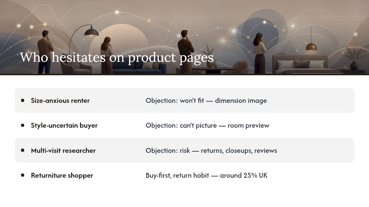
Three buyer types account for most furniture cart abandonment, and each objects for a different reason.
The size-anxious renter or small-space buyer. They've been burned before, or they've heard about someone who has. Their objection isn't about price or style; it's a flat "I don't trust that this will fit." A dimension image with a scale reference answers this more directly than any amount of persuasive copy.
The style-uncertain first-time buyer. They like the product photo but can't picture it against their own walls, flooring or existing furniture. This is the shopper a room-preview tool is built for; showing the item in their actual space replaces guesswork with a direct answer.
The high-consideration, multi-visit researcher. They come back three or four times before buying, comparing materials, reading every review, checking delivery terms. They're not stuck on fit or style; they're stuck on risk. Clear returns policy, honest close-up photography and verified buyer images do more for this group than any visualisation tool, because their objection is trust, not visibility.
A fourth pattern worth naming separately: the "returniture" shopper, common among younger buyers, who orders with the explicit plan of trying it at home and sending it back if it's wrong. Industry reporting suggests around a quarter of British shoppers have returned a large furniture item, and this buy-first-decide-later habit is a meaningful share of that. Visualisation tools don't eliminate this behaviour, but by resolving fit and style doubt before the order ships, they remove the main reason this shopper needed a physical trial in the first place.
Writing product descriptions that sell and rank
A furniture product description carrying only "beautiful, comfortable, stylish" tells a search engine nothing specific and gives a hesitant buyer nothing to act on. The fix is the same for both audiences: specificity.
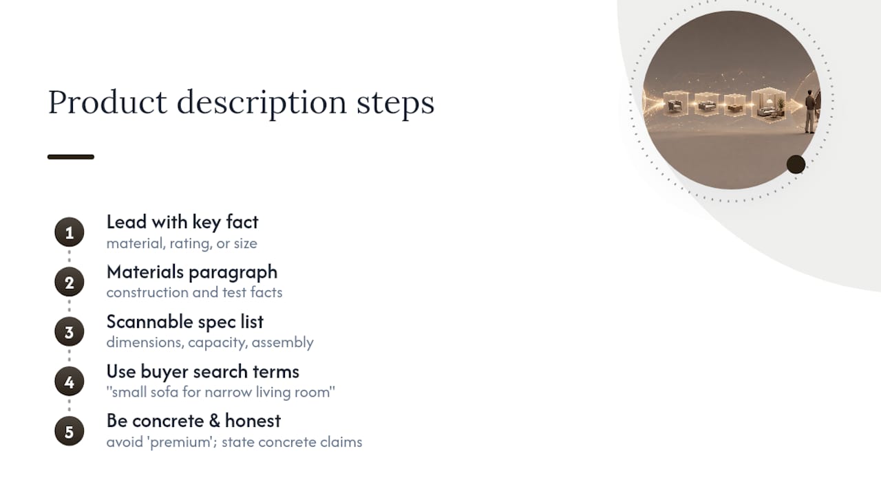
Lead with the functional facts a shopper is actually searching for: material composition, dimensions, weight capacity, assembly requirement. A sentence like "solid oak frame with a 140kg weight rating, flat-pack with a 20-minute assembly" does more SEO and persuasion work than three adjectives strung together, because it matches how people actually search and it answers a real objection in the same breath.
Structure matters as much as content. Put the single most persuasive, specific fact in the first sentence, since that's what search snippets and AI answer summaries tend to pull. Follow with a short paragraph on materials and construction, then a scannable spec list for the dimension-hunters who skip straight past prose. Use the terms your buyers actually type; "small sofa for narrow living room" beats "compact seating solution" every time, in rankings and in comprehension.
Avoid generic superlatives that carry no information. "Premium quality" says nothing a search engine or a sceptical buyer can verify. "Kiln-dried hardwood frame, tested to 50,000 flex cycles" says something concrete, and concrete claims are what both Google's ranking systems and hesitant shoppers respond to. Where you can, work in the material honesty point from earlier: if a fabric photographs lighter than it appears in person under certain lighting, say so in the description rather than letting the return do the talking.
Turning reviews into a genuine trust signal
Star ratings alone are close to meaningless on furniture pages, since almost every listing sits between four and five stars. What actually moves a hesitant buyer is specificity within the review itself, particularly photos.
Customer-submitted photos showing the piece in a real room, at a real angle, under real lighting, do more to resolve doubt than another studio shot ever will. They answer the "does this look as good outside a photography studio" question that no amount of retouched hero imagery can address credibly. Prioritise surfacing reviews that mention fit, colour accuracy against the listing photos, and assembly time, since those are the three things buyers are quietly worried about.
Verified purchase tags matter more on big-ticket furniture than on low-cost categories, because the financial stakes of a wrong decision are higher. A review from a confirmed buyer carries more weight than an unverified comment, and surfacing that distinction visibly, rather than burying it in small print, reassures the researcher-type buyer described earlier.
Where a retailer has permission to use them, review photos can double as content for the room-preview experience or as supporting imagery elsewhere on the page. That's a genuine efficiency gain: one piece of customer-generated content, two conversion jobs.
Getting the mobile experience right
Furniture shopping happens disproportionately on mobile, often in short bursts while someone measures a wall or checks a room. That context changes what the product page needs to do well.
Dimension images need to remain legible at phone width; a tiny annotated diagram that's readable on desktop but illegible on a five-inch screen defeats its own purpose. Test every dimension graphic and zoom feature on an actual handset, not just a browser resized to look like one.
Room-preview tools built for mobile from the outset, rather than adapted from a desktop-first AR experience, tend to have far better completion rates, since shoppers are often standing in the room they're trying to furnish, phone in hand, camera ready. That's precisely the moment a "try it in your room" prompt should appear, not three scrolls down the page. Keep tap targets large, keep the upload flow to two steps or fewer, and make sure the composited result loads fast enough that an impatient thumb doesn't bail before it renders.
Cross-selling without derailing the sale
The instinct to bolt a "complete the look" carousel onto every product page is understandable, but on furniture pages it often competes with, rather than supports, the primary decision. Sequence matters.
Show complementary items, a matching side table, a coordinating rug, a cushion set, only after the shopper has resolved fit and style doubt on the main product, typically below the dimension image and room preview rather than above them. Bundling a delivery incentive, such as combined shipping when two items ship together, tends to convert better than a generic "you might also like" list, because it answers a practical cost question rather than just suggesting more spending.
Upselling within the same product, offering a larger size or a premium fabric grade at checkout, works best when the price difference is shown against the same annotated dimension image, so the shopper can immediately see what the larger option looks like in real terms rather than as an abstract price delta.
Where AR goes next, beyond a basic preview
Room-preview and photo-compositing tools solve the immediate fit-and-style problem, but the category is moving toward richer applications worth watching even if you're not ready to build them yet.
Multi-item room planning, letting a shopper place a sofa, a coffee table and a rug together in one preview rather than one item at a time, addresses how people actually furnish a room: as a set, not a sequence of single purchases. Web-native AR is also starting to appear inside in-store kiosks and sales-assist tools, letting a shop-floor associate show a shopper how a floor model would look in their actual home before they leave the store, which blurs the line between digital and physical retail rather than keeping them separate.
None of this requires abandoning a simpler, lower-friction starting point. The retailers seeing the strongest results tend to be the ones who proved the concept with a lightweight tool first and only invested in richer AR where the data justified the build cost.
Start with measurement, not the shiniest tool
Visualisation stopped being a differentiator some time ago; it's now closer to a baseline expectation, and retailers still relying on plain studio shots and a spec table are competing on outdated terms. The mistake I see most often isn't skepticism about visualisation. It's the opposite: teams commit to an expensive 3D programme before they've proven the basic version works on their own catalogue.
Start smaller than feels comfortable. Fix the dimension images and texture close-ups first, since they're cheap and fast, then layer in a room-preview pilot on a tight SKU list. Read the preview engagement data properly, feed it to merchandising and to whoever owns returns prevention, and let that evidence decide whether the next investment is a broader rollout or a move to richer 3D and AR. The teams that skip straight to the most sophisticated tool usually can't tell you afterwards which part of it actually worked.
— Michael
Try the room-preview widget before you commit to anything bigger
This is a low-risk way to test everything above without waiting on a photography reshoot or a 3D asset pipeline. Shoppers upload a photo of their own room, and within about 30 seconds they see your actual product composited into it, no app download, no new photography required, because it works from the JPEGs already sitting in your catalogue.
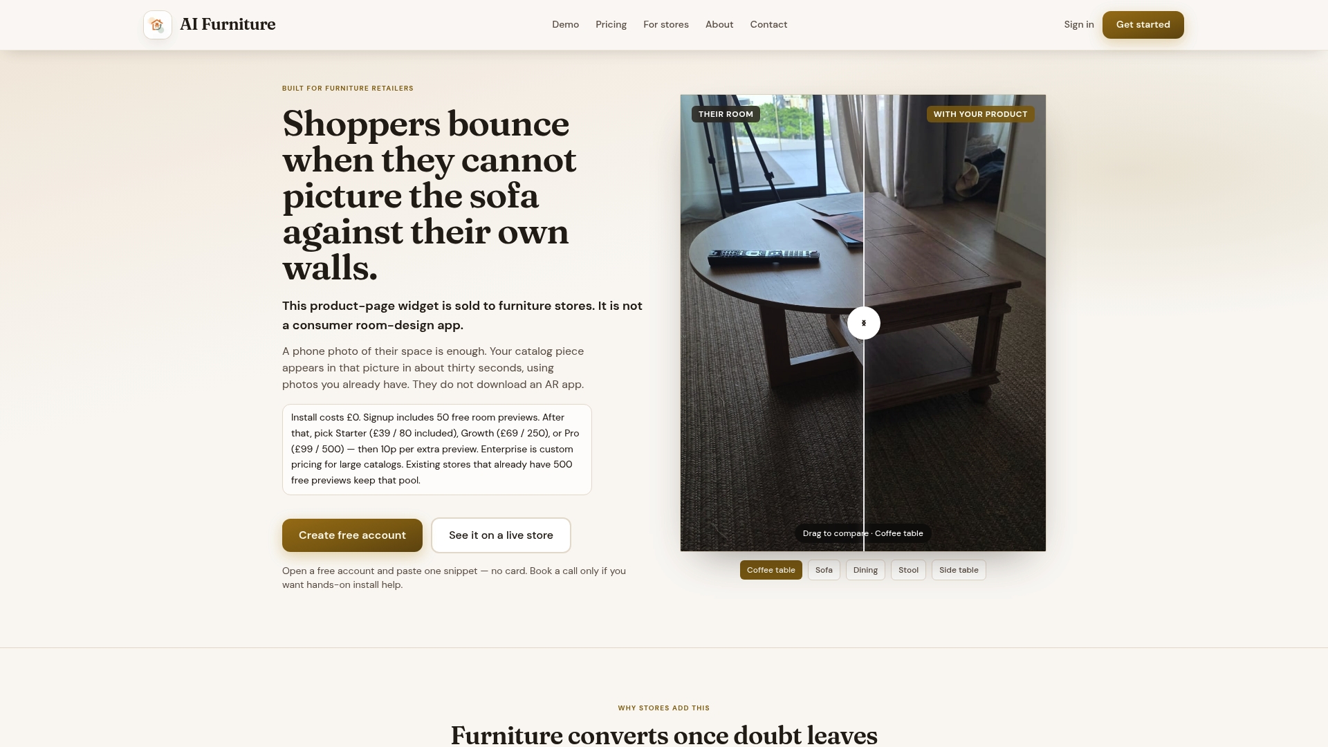
The widget integrates with common ecommerce platforms, allowing easy addition to a pilot set of product pages without a development sprint. The 500 free previews give you enough volume to run a genuine merchant bake-off: pick your highest-return, highest-traffic SKUs, turn the widget on, and measure the conversion and returns shift before a single pound goes toward a paid plan. If you want to see how it stacks up against 3D and other visualiser approaches first, the comparison page walks through where each method fits. Otherwise, the fastest next step is running your own product images through the live demo and seeing the composited result for yourself.
Sources
- 3D Cloud Furniture Shopping Trends Study (PR Newswire)
- Academic study on visual-based tactile cues and purchase intention (2026)
- Furniture returns: rates, costs and fixes (Soda Web Media)
- Furniture return rate: causes and how to cut it (SizeMarker blog)
FAQ
Does a room-preview tool actually reduce furniture returns?
It targets the two leading causes of preventable returns, size mismatch and style disappointment, by letting shoppers confirm fit and look before they buy rather than after delivery.
How long should an A/B test for a visualisation pilot run?
Plan for a minimum of two to four weeks depending on traffic volume, with preview interactions logged per order so you can compare return rates between engaged and non-engaged cohorts afterwards.
Do I need 3D models to offer a room preview?
No. Photo compositing works from existing catalogue JPEGs and requires no app download, which is why it's the faster and cheaper starting point compared with building 3D assets for a full catalogue.
What is a realistic first pilot size?
Twenty to fifty SKUs, chosen from your highest-return, highest-traffic, or highest-order-value items, gives you a meaningful read without asking every product team to prep imagery at once.
Can I test this without committing to a paid plan?
Yes. Aifurniture's widget includes 500 free previews, enough to run a pilot on a focused SKU list and measure conversion and returns impact before paying for anything.