
Use loading="lazy" on every offscreen image, leave your hero and above-the-fold images out of it entirely, and set width/height or aspect-ratio on all of them. That's the whole strategy for most sites. Anything more elaborate, Intersection Observer scripts, polyfills, custom thresholds, only earns its complexity when native browser support genuinely falls short of what your layout needs.
TL;DR:
- Native lazy loading with
loading="lazy"works best for offscreen images, but hero and above-the-fold images should be eagerly loaded to prevent delays in Largest Contentful Paint.rootMarginin Intersection Observer can be adjusted between 200px and 400px, with larger margins preferred for mobile due to faster scroll speeds, and support detection should always precede implementation.- Lazy loading of third-party widgets benefits from a facade pattern involving placeholders, preconnects on hover, and injection upon interaction to reduce load time without sacrificing user experience.
- Delay in loading the main content image or the largest visible element significantly impacts core web vitals, especially in mobile contexts, requiring careful support detection and testing under throttled networks.
- Proper image attributes, including
width/heightoraspect-ratioand modern formats like WebP or AVIF, are essential alongside lazy loading to optimize page speed and prevent layout shifts.
Table of Contents
- How does browser-native lazy loading work?
- When should you use Intersection Observer instead?
- Which images should never be lazy-loaded?
- Does lazy loading really improve load speed?
- How do you lazy-load third-party widgets safely?
- How do you measure whether lazy loading actually helped?
- Best-practices checklist for implementation
- What surprises developers most about lazy loading widgets?
- Where to read the primary documentation
- Sources
- FAQ
How does browser-native lazy loading work?
The loading attribute takes three values, and picking the right one is the entire skill. loading="lazy" tells the browser to defer fetching until the image nears the viewport. loading="eager" forces an immediate fetch, which is the default and exactly what you want for anything visible on page load. loading="auto" hands the decision back to the browser's own heuristics, which in practice behave like the default in most engines.
What counts as "near the viewport" isn't fixed. Browsers calculate a distance-from-viewport threshold that adapts to the connection speed detected for that session, loading images earlier on slower connections so they're ready by the time a user scrolls to them. You don't control that number directly, and you shouldn't try to. According to Web, this native approach is recommended specifically for offscreen images, with an explicit warning against applying it to anything likely to sit in the initial viewport or count as your Largest Contentful Paint element.
Applying this across markup is simple:
- Standard
<img>: addloading="lazy"alongsidesrc,width, andheight. <picture>elements: putloading="lazy"on the nested<img>, not on<picture>itself.<img srcset>responsive images: the attribute works the same way regardless of how many sources you list.
Support across major browsers is strong enough that you rarely need a fallback, though MDN's lazy loading reference is worth bookmarking if you're auditing an older codebase for gaps.
When should you use Intersection Observer instead?
Reach for Intersection Observer when native loading="lazy" can't give you what the page needs: custom trigger distances, lazy-loading background images set via CSS, deferring non-image elements, or supporting a browser old enough to ignore the attribute. For everything else, native wins on simplicity and maintenance cost.
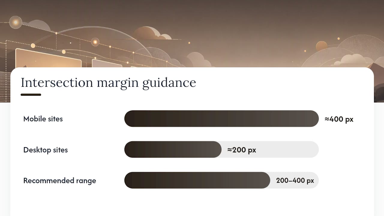
The setting developers get wrong most often is rootMargin. A tight margin means images pop in visibly as users scroll, especially on mobile where scroll velocity is high. A wider margin, somewhere between 200px and 400px, starts the fetch before the image reaches the visible area, so it's already rendered by the time the user gets there. Mobile sites generally want the larger end of that range because thumb scrolling covers distance fast; desktop sites with slower, more deliberate scrolling can often get away with less.
A practical build looks like this:
- Check for native support first with
'loading' in HTMLImageElement.prototype. - If supported, apply
loading="lazy"and skip the observer entirely. - If not supported, instantiate an Intersection Observer with a generous
rootMargin, watch each placeholder image, and swap in the realsrcwhen it intersects. - Load a polyfill such as lazysizes only inside that unsupported branch, never unconditionally.
This support-detection pattern avoids shipping observer code and its overhead to the vast majority of visitors on modern browsers, a point web.dev also makes when discussing polyfill strategy.
Pro Tip: Test your rootMargin value with throttled 3G in Chrome DevTools, not just on your office Wi-Fi. A margin that feels generous at full speed can still feel late on a real mobile connection.
Which images should never be lazy-loaded?
Your Largest Contentful Paint element, whatever image or text block the browser judges as the largest visible content during load, must never carry loading="lazy". Delaying it delays the metric search engines and Core Web Vitals use to judge your page's perceived speed. Hero banners, above-the-fold product photography, and logo images in the header all fall into this category on most layouts. Leave them at the default eager behaviour, or set loading="eager" explicitly so the intent is obvious to anyone reading the code later.
Layout shift is the second failure mode, and it's sneakier because it doesn't show up until a real user scrolls. web.dev's CLS guidance explains the mechanism plainly: a browser can't reserve space for an image it knows nothing about. Without width and height attributes or a CSS aspect-ratio rule, the browser may treat the element as having no dimensions at all, which can undermine the point of deferring it in the first place and jolts the page as it finally loads.
Three edge cases catch people out repeatedly:
- Carousels: slides two and three onward are technically offscreen, but users often reach them within a second of page load, so test whether lazy-loading them actually helps or just adds a visible pop-in.
- CSS-hidden images: an image hidden with
display: noneand later revealed by JavaScript won't trigger the browser's lazy fetch the way a genuinely offscreen image does; behaviour here is inconsistent across engines. - Responsive breakpoints: an image that's decorative and hidden on mobile but a hero on desktop needs different lazy-loading treatment per breakpoint, not one blanket rule.
Audit for regressions by resizing the viewport, scrolling every carousel slide, and checking DevTools' Layout Shift Regions overlay after each change.
Does lazy loading really improve load speed?
Yes, and the third-party evidence is specific: deferring storefront widgets such as review blocks correctly can cut hundreds of milliseconds off main-thread blocking time, according to an audit of lazy-loaded Shopify review widgets. That's not a marginal gain on a product page where every added script competes for the same thread as your "add to basket" button.
How do you lazy-load third-party widgets safely?
Third-party embeds, review widgets, chat bubbles, social feeds, video players, are the part of the page image-focused lazy loading never touches, and they're often heavier than every image on the page combined. The fix is the facade pattern: render a lightweight static placeholder that looks like the real widget, then swap in the actual script only on interaction.
- Placeholder: show a static image or CSS mock of the widget, styled to match, with zero third-party JavaScript loaded.
- Preconnect on hover: when the user's cursor approaches, fire a
preconnectto the widget's domain so the DNS and TLS handshake are already done. - Replace on click or scroll-into-view: inject the real embed script only when the user actually engages, or when it's genuinely about to be needed.
This is the exact sequence Chrome's Lighthouse documentation on third-party facades recommends, and it's why YouTube embeds, review widgets, and live chat are the classic facade candidates: heavy scripts, low immediate necessity.
The trade-off is functional loss. A facaded video loses autoplay until clicked; a facaded chat widget might lose its "agent online" badge until the real script loads. List what each embed loses before you ship it, then test three scenarios specifically: a user scrolling past the widget without stopping, a user arriving via a jump-to-anchor link that lands directly on it, and a user on a throttled connection who clicks before the facade has fully reconnected.
How do you measure whether lazy loading actually helped?
Watch three Core Web Vitals: LCP, CLS, and INP. Lazy loading should improve or hold LCP steady (it will actively hurt LCP if you mistakenly deferred your hero image), should never worsen CLS if your dimensions are set correctly, and rarely touches INP unless a poorly deferred widget blocks the thread right when a user tries to interact with it.
Run Lighthouse before and after each change for a controlled lab comparison, then validate with real-user monitoring, because lab tests can't replicate the range of devices and connections your actual visitors use. Three scenarios catch almost every regression:
- Scroll-through: scroll the full page at a natural pace and watch for visible pop-in.
- Jump-to-anchor: land directly on a mid-page anchor link and confirm the target content isn't still deferred.
- Slow-network simulation: throttle to slow 3G in DevTools and check nothing critical stalls behind a lazy-loaded dependency.
If LCP regresses after adding lazy loading, the most common cause is a hero image that got swept up in a blanket loading="lazy" rule meant only for below-the-fold content. Fix the selector, not the strategy.
Best-practices checklist for implementation
Run through this before calling any lazy-loading rollout finished:
- Apply
loading="lazy"to every offscreen image,loading="eager"(or nothing) to LCP and above-the-fold images. - Set
width/heightor CSSaspect-ratioon every image, no exceptions. - Compress images and serve modern formats like WebP or AVIF alongside your fallbacks.
- Detect native support before loading any polyfill; never ship lazysizes unconditionally.
- Defer heavy third-party widgets with the facade pattern rather than image-style lazy loading.
- Test jump-to-anchor links and slow-network scenarios, not just a normal scroll.
| Area | Native rule | Watch for |
|---|---|---|
| Images | loading="lazy" offscreen, eager for LCP | Hero images accidentally deferred |
| Layout | width/height or aspect-ratio always set | Missing dimensions causing CLS |
| Third-party widgets | Facade placeholder, preconnect on hover | Lost functionality (autoplay, live badges) |
| Older browsers | Feature-detect, then polyfill | Shipping lazysizes to everyone by default |
What surprises developers most about lazy loading widgets?
Native loading="lazy" is enough for the overwhelming majority of image-heavy pages. It's a one-attribute fix, and I'd rather see a team ship that correctly than half-build an Intersection Observer system nobody maintains afterwards.
Where teams get caught out is storefront widgets, not images. A product-page visualiser or review block that loads fine on a desk Wi-Fi connection can stall badly on a mid-range phone on real mobile data, because the script cost hits the main thread regardless of when it fires. Platform defaults compound this: convenient built-in lazy settings on some ecommerce platforms weren't necessarily built with your specific layout in mind, so Cloudflare's own explainer on lazy loading is right to flag that you should verify rather than assume.
Test on an actual mid-range phone over throttled data before you trust any lazy-loading setup, native or scripted. Office Wi-Fi lies to you every time.
— Michael
Where to read the primary documentation
For specs and deeper detail, go to MDN's lazy loading reference, web.dev's browser-level lazy loading guide, and Chrome's Lighthouse facade documentation for third-party embeds.
If your store adds a product-page visualiser on top of these fixes, treat it like any other heavy widget. Aifurniture's room-preview widget is built to sit behind exactly this kind of deferred loading, so shoppers still get a fast product page and a working "see it in your room" tool without one undermining the other. Plans start at $52.56 a month on the Starter tier, with Growth and Pro available as usage grows, and retailers on Shopify can check the platform-specific integration notes before rolling it out.
Sources
- Web
- Lazy load third-party resources with facades | Lighthouse | Chrome for Developers
- DebugBear blog: lazy load background images / Intersection Observer guidance
FAQ
What Is Lazy Loading of Images?
Lazy loading is a technique that defers fetching an image until it's about to enter the viewport, rather than downloading every image on a page immediately. The browser-native version uses the loading="lazy" attribute on an <img> tag, as documented by MDN.
Can You Give an Example of Lazy Loading?
A long product listing page with many images is a clear example: only the first handful visible on load fetches immediately, and the rest download one by one as the user scrolls down. Adding loading="lazy" to each <img> tag below the fold achieves this with no JavaScript required.
What Does Lazy Loading Mean in Practice?
It means a page's initial load only pulls in what's genuinely needed to render what the user can see, cutting the amount of data and the number of requests made upfront. Everything else, images, widgets, embeds, arrives just in time as the user scrolls toward it.
How Do You Get Images to Load Faster?
Combine loading="lazy" on offscreen images with compressed, modern formats like WebP, and always set width and height so the browser can reserve layout space without waiting on the image itself. For hero images, do the opposite: load them eagerly so they don't delay your Largest Contentful Paint.