
The non-negotiables are simple to list and hard to skip: a high-resolution isolated cutout, front/three-quarter plus side/rear and detail shots, accurate physical dimensions and variant metadata, and consistent colour balance with clean edges. Miss any one of these and compositing tends to distort scale, smear finish, or misplace the item entirely. Check these first, then send the file set to whoever handles your widget integration.
TL;DR:
- High-resolution master files should be at least 2,000×2,000 pixels to support reliable zooming and compositing, especially for detailed furniture items.
- Every SKU must include a transparent background PNG with clean edges, accurate physical dimensions, and comprehensive metadata for proper placement and scaling.
- Consistent studio setup, fixed camera angles, and batch labeling are essential for producing a large catalog of uniformly high-quality images.
- Uploaded assets require complete metadata, including SKU, variant ID, dimensions, orientation, and depth hints, to ensure accurate placement in room scenes.
- A small pilot with 10 to 25 approved assets and review gates for scale, shadow, and color mismatches helps prevent costly errors before full deployment.
Table of Contents
- What are the technical requirements for room-compositing product images?
- Building a repeatable capture checklist for your studio
- Preparing files and metadata for the room-preview widget
- The QA checklist that catches failures before shoppers see them
- Getting a room-preview widget live: integration notes
- Compression and delivery: keeping images fast without losing detail
- Marketplace and platform image rules you still need to respect
- Copyright, trademarks, and usage rights on product images
- Accessibility: alt text and descriptive metadata for product images
- Staged scenes versus plain white background: which one sells
- Where room-compositing belongs in your photography strategy
- Run a pilot with Aifurniture before you commit your whole catalogue
- Curated reading and platform guidance
- Sources
- FAQ
What are the technical requirements for room-compositing product images?
Start with resolution. Working master files should sit at 2,000×2,000px or higher for most furniture pieces, since anything smaller starts to break down the moment a shopper zooms in on stitching or grain. Platform guidance on marketplace imagery commonly points to a floor of 1,000px on the longest side, but for detailed zoom and reliable compositing you want to be well above that, closer to the 2,000×2,000px range where a photograph can support it.
Every SKU needs an isolated transparent-background master saved as a PNG, with a clean edge mask and no haloing around the silhouette. That halo, the faint ghost of the old background clinging to the edges, is one of the most common reasons a composited sofa looks like it's floating rather than sitting on a floor.
Colour accuracy is where a lot of catalogues quietly fail. Photograph a colour reference card alongside each fabric or finish, and keep white balance uniform across the entire shoot session. A cushion that reads warm grey in one shot and cool grey in the next will not match once it's dropped into a customer's living room photo, and the mismatch is usually blamed on the widget rather than the source image.
You need more than one angle. At minimum:
- Front and three-quarter views to establish the item's primary silhouette and proportions
- Side or rear views to give the compositing engine genuine depth information
- Close-up detail shots covering hardware, joinery, and material texture
Multiple views paired with factual dimensions reduce ambiguity for generative placement systems, which is exactly what you're trying to eliminate.
Finally, metadata. Every asset should travel with its SKU, variant ID, width×depth×height in millimetres or centimetres, leg clearance where relevant, and the focal length and orientation the shot was captured at. These fields anchor placement, not just the pixels.
Building a repeatable capture checklist for your studio
A one-off perfect shot is easy. A thousand consistent ones across a growing catalogue is the actual job, and it's where most teams fall down.
- Match camera angle to product type. Sofas and armchairs read best from eye level at a slight three-quarter turn; rugs need an overhead shot with a small angle to avoid flattening the pile; storage units want a straight front shot plus a side profile to show depth.
- Fix your lighting rig once and don't touch it. Use a consistent colour temperature and soft, even light across the session. Mixed light sources and specular hotspots on glossy finishes are two of the fastest ways to wreck colour fidelity downstream.
- Pack the shoot properly. Bring a colour card into frame for a reference shot, keep a tape measure visible in at least one reference image per piece, and capture every fabric or finish swatch separately.
- Batch and label as you go. Consistent file naming and variant labelling at the point of capture saves hours of retouching triage later.
- Save your cutout as a reusable master. Isolate the product once, store that transparent PNG as the master asset, and generate every channel export or room scene from it rather than re-isolating per use case. This is the workflow behind most scalable catalogue visualisation pipelines, and it cuts both cost and error rate.
- Know when photography isn't enough. Fitted wardrobes, modular kitchen runs, and other installation-dependent pieces need measured 3D or CAD data, not just a good photograph, because fit tolerances matter more than appearance.
The source image is the ceiling on everything that follows. Errors introduced at capture, a slightly warped lens, a poorly masked edge, propagate and amplify once the item is generated into a room scene, so the fifteen extra minutes spent getting the studio shot right pays for itself many times over.
Preparing files and metadata for the room-preview widget
What you upload to the widget isn't the same as what you shoot. Three assets per SKU cover most cases: the transparent PNG master, a high-resolution JPEG reference for colour and lighting checks, and separate detail crops for hardware or texture.
Handle sizing as a derivation, not a re-edit. Keep the master at full resolution and generate channel-specific sizes from it, for example stepping down from 2,000×2,000px to 1,200×1,200px to 800×800px, rather than re-processing the original for every platform. Storing one approved master and deriving exports from it is faster and less error-prone than repeating isolation work per channel.
Metadata does the heavy lifting on placement:
- SKU and variant ID so the correct finish or fabric loads every time
- Physical dimensions so scale in the room photo is calculated correctly rather than estimated
- Orientation anchors, such as front-edge coordinates or a floor-contact pair, that tell the compositing engine which way the item faces and where it touches the ground
- Depth hints for pieces with an obvious front-to-back profile, like wing chairs or chaises
Supplying SKU, dimensions, and orientation data at upload speeds up placement and reduces hallucinated positioning. Lock down naming and version control too. A "final_v3" file sitting next to an actual final version is how the wrong finish ends up in a shopper's living room.
The QA checklist that catches failures before shoppers see them
Run every composited image through four gates before it goes live.
- Product-truth gate. Compare the generated result against your studio reference at 100% zoom. Check seams, cushion fill, hardware placement, and finish colour against the original.
- Scale and perspective gate. Cross-check the item against known-height objects in the room photo, a doorway, a rug edge, a light switch, to confirm proportions haven't drifted.
- Contact and shadow gate. A correctly placed piece casts a contact shadow pointing the same direction as the room's existing light sources. No shadow, or a shadow facing the wrong way, is an instant red flag.
- Material fidelity gate. Texture, pile, grain, and finish need to read correctly at normal viewing size, and colours must match your reference card, not just look "close enough."
Product integrity checks, shape, finish, and scale staying fixed while only the environment changes, are a core QA requirement for any room-scene workflow, not an optional polish step.
Pro Tip: Keep a shared "failure gallery" of rejected composites, tagged by cause (scale, shadow, colour, edge halo). Reviewing it before a new SKU batch catches the same mistakes repeating themselves.
Anything that fails product-truth or material fidelity twice in a row should go straight to a retoucher rather than back through the same pipeline. If the failure is about fit rather than appearance, a wardrobe that needs to sit flush against a wall, for instance, that's a signal to commission measured 3D data instead of pushing harder on photography.
Getting a room-preview widget live: integration notes
At upload, a room-preview widget needs three things to place an item correctly: the isolated master asset, its dimensions metadata, and a variant ID with orientation flags. Without all three, the widget is guessing at scale and facing, and guessing shows.
Run a pilot before you commit the full catalogue:
- Select a small set of SKUs, ideally your bestsellers plus one awkward shape (a chaise, a corner unit)
- Upload approved masters with complete metadata
- Use the allowance of free previews to log every failure mode you see: wrong scale, wrong facing, colour drift
- Feed those failures back into your capture or metadata process before scaling up
Running small, controlled pilots with explicit review gates for product truth, brand fit, and channel compliance before scaling is standard practice, and it's far cheaper than discovering a systemic problem after 2,000 SKUs are live.
Preview latency matters more than most teams expect. A shopper who waits ten seconds for a composite starts to doubt the tool works; under three or four seconds and they'll try it on multiple products, which is exactly the behaviour that drives conversion. Integration paths for platforms like Shopify typically follow a standard app or script-tag pattern, with similar embed approaches for other common storefronts.
Assign clear ownership before launch: someone signs off on product-truth QA, someone owns retouching escalations, and someone actually reads the preview analytics weekly rather than checking them once at launch and never again.
Compression and delivery: keeping images fast without losing detail
A perfect 2,000×2,000px master is wasted if it loads slowly on a shopper's phone. The fix is layered delivery, not a single compressed file for every use.
Keep your master uncompressed or lightly compressed as the archival source, then generate delivery versions using modern formats. WebP and AVIF typically produce noticeably smaller files than JPEG at equivalent visual quality, and both are widely supported across current browsers. PNG stays reserved for assets that genuinely need transparency, your isolated cutout masters, since PNG's lossless compression makes it far heavier than JPEG or WebP for a fully opaque photograph.
For web and mobile delivery, generate at least three sizes per asset rather than serving one file to every device: a thumbnail for grid views, a mid-size for product cards, and a full-resolution version for zoom. Pair this with srcset and responsive image markup so mobile users on slower connections aren't downloading a desktop-sized file unnecessarily.
Lazy loading matters as much as compression for perceived speed. Loading offscreen product images only as a shopper scrolls toward them keeps initial page weight down, which matters directly for both bounce rate and mobile conversion. Run your compressed exports through a visual check before publishing. Aggressive compression can introduce banding on gradients or muddy fine texture, exactly the details a room-preview widget relies on to render fabric and finish convincingly.
Marketplace and platform image rules you still need to respect
Room-compositing requirements sit on top of your standard platform image rules, not instead of them. Every export you produce still has to satisfy whichever channel it's published to.
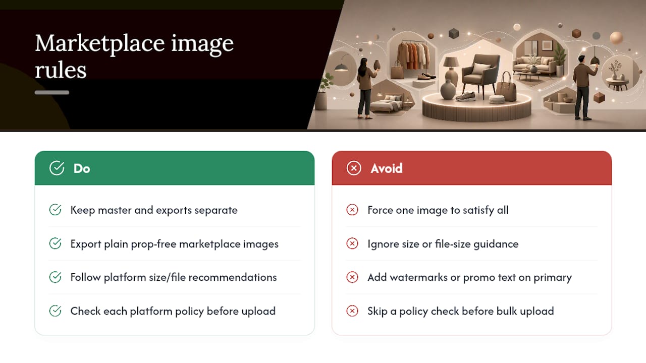
Amazon enforces minimum pixel dimensions for zoom functionality on main listing images and restricts what can appear in that primary image (no watermarks, no promotional text, no additional props beyond the product itself for most categories). eBay has its own minimum size floor and similarly limits text overlays on the primary photo. Shopify, Magento, BigCommerce, and WooCommerce are more permissive on styling but each has its own recommended maximum file size and dimension guidance for storefront performance, and going well beyond those recommendations slows your product pages down regardless of how good the image looks.
The practical approach is to treat your isolated master and your marketplace-compliant export as two different outputs from one source, exactly the master-plus-derivatives workflow already covering your compositing needs. Generate the plain, prop-free, correctly sized version for the marketplace channels that demand it, and reserve staged or lifestyle imagery for channels that allow it. Trying to force one image to satisfy every platform's rules simultaneously usually means it satisfies none of them particularly well.
Check each platform's current image policy directly before a bulk upload. These specifications get revised periodically, and a batch rejected at the point of upload costs far more time than a five-minute policy check beforehand.
Copyright, trademarks, and usage rights on product images
Ownership of a product photograph usually rests with whoever took it, or whoever commissioned it under a work-for-hire agreement, not automatically with the retailer displaying it. If you're using a manufacturer-supplied image rather than your own studio shot, confirm in writing that you have licence to use it on your storefront and in any derivative formats, including composited room scenes.
Composited images raise a specific question worth settling early: does generating a room scene from a licensed product photo count as a "derivative work" that falls outside your original usage licence? Manufacturer agreements vary, and the safest position is to ask explicitly rather than assume standard product-page usage rights extend automatically to compositing use cases.
Trademarks apply to branding visible within a shot, a logo on furniture hardware, a distinctive fabric pattern under design protection, or a brand name printed on packaging left in frame accidentally. Crop or blur anything that isn't your own registered mark unless you have explicit permission to display it.
If you commission external photography, get the usage rights in the contract before the shoot, not after. Specify whether the retailer owns the images outright or holds a licence, whether that licence covers derivative and composited uses, and whether it extends to future marketing beyond the product page itself. A cheap shoot with restrictive rights costs more in the long run than a slightly pricier one with rights that actually cover how you intend to use the images.
Accessibility: alt text and descriptive metadata for product images
Alt text serves two audiences simultaneously: shoppers using screen readers, and search engines trying to understand what an image shows. Both reward the same discipline, specificity over decoration.
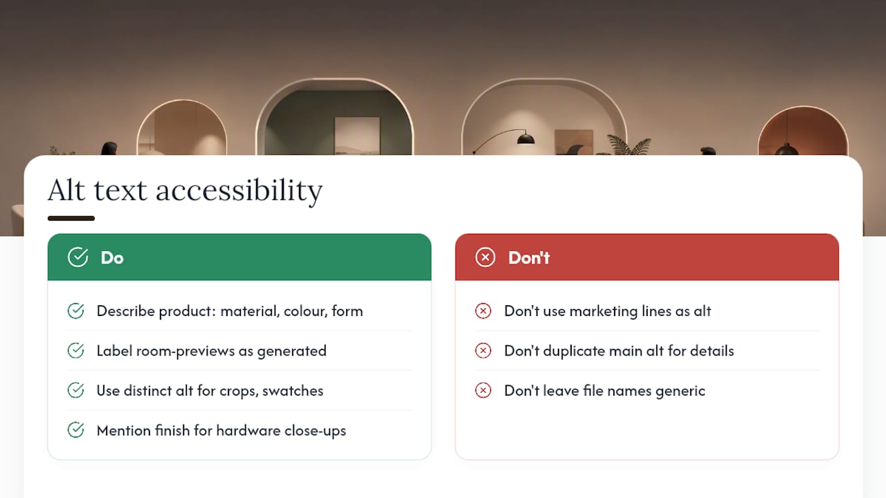
Write alt text that describes the actual product, not a marketing line. "Grey linen three-seater sofa with oak legs" tells a screen reader user precisely what they'd see; "beautiful statement piece for your living room" tells them nothing useful. Include the material, colour, and form factor, since those are the details a shopper actually needs to picture the item.
For a room-preview composite specifically, alt text should identify that the image is a rendered preview rather than a photograph of the item in a real showroom setting, so a screen reader user isn't misled about what they're looking at. Something like "AI-generated preview of grey linen sofa placed in a customer's living room" is honest and still descriptive.
Detail crops and swatch images need their own distinct alt text rather than a duplicate of the main product description. A hardware close-up should mention the finish and material specifically, brushed brass hinge, oak dowel joint, since that's exactly the detail a visually impaired shopper is trying to establish through the description.
Keep descriptive metadata (file names, structured product data, image titles) aligned with the alt text rather than contradicting it. A file named "IMG_4471.jpg" attached to an alt tag reading "walnut sideboard front view" is a missed opportunity; rename the file to match, and the consistency helps both accessibility tooling and search indexing read the image the same way.
Staged scenes versus plain white background: which one sells
Neither format wins outright, they answer different questions. A white or neutral background image answers "what exactly is this item," stripped of context, ideal for comparison shopping and marketplace compliance. A staged or room-composited image answers "how would this look in a space like mine," which is the question that actually drives furniture purchase decisions.
The evidence-backed approach isn't picking one over the other, it's sequencing them correctly on the product page. Lead with a clean, plain-background hero shot so the item itself is unambiguous, then follow with staged or composited room views as supporting evidence. Shoppers scanning quickly get clarity first. Shoppers who linger get the reassurance of scale and style second.
Room-preview widgets solve a version of staging that static lifestyle photography cannot do: they use the shopper's own room rather than a generic showroom. A generic staged photo shows how a sofa looks in some living room. A composited preview shows how it looks in this shopper's living room, with their actual wall colour and their actual proportions, which is a meaningfully stronger signal of fit than any static lifestyle shoot can offer.
That said, generated scenes are illustrative rather than exact, and for pieces where precise fit genuinely matters, a built-in unit or a tight stairwell delivery, no image format substitutes for measured data. Use staged and composited imagery to build confidence and reduce hesitation; reserve exact-fit claims for cases where you've actually measured the space.
Where room-compositing belongs in your photography strategy
Generated room scenes earn their place on scale, variety, and speed: refreshing a campaign look across a thousand SKUs in days rather than months. Reserve real photography or measured 3D for anything requiring proven fit, built-ins, tight installations, or hero SKUs where brand perception rides on the shot. Framing prompts and QA around the room rather than the product, keeping the product itself as the fixed reference, is what keeps this distinction from blurring in practice.
Start with one pilot category. Lock three or four scene templates, run them through your QA gates until failures stop repeating, then scale. Track return rates, preview engagement, and conversion uplift, not just image output volume, to know if it's actually working.
— Michael
Run a pilot with Aifurniture before you commit your whole catalogue
This room-preview solution skips the app download and the 3D modelling overhead that AR-based tools usually demand: retailers use product photos they already have, shoppers preview instantly in-browser, and billing tracks actual usage rather than a flat monthly fee regardless of volume.
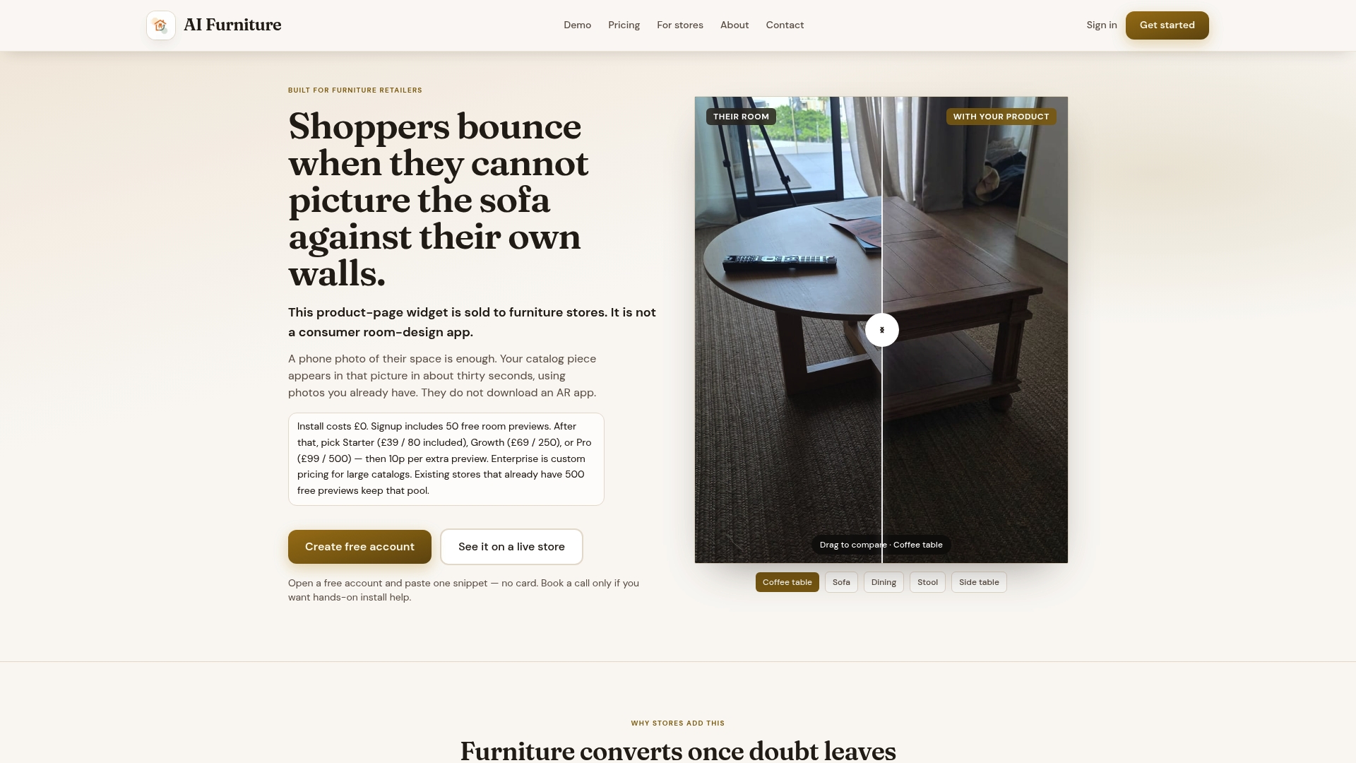
The widget integrates with Shopify, Magento, BigCommerce, WooCommerce, and custom storefronts, and new accounts start with a free preview allowance, enough to properly stress-test the checklist covered above against real shopper uploads. A sensible pilot looks like this: prepare 10 to 25 approved master assets using the resolution, view, and metadata standards from this article, upload them, and run through the free previews while logging every scale, shadow, or colour mismatch you spot. Fix what needs retouching, then decide whether to scale.
Once the pilot clears your product-truth and scale QA gates consistently, moving to a paid plan is straightforward. Check current pricing across the Starter, Growth, and Pro plans, or book a call to talk through integration on your specific platform before you commit further budget.
Curated reading and platform guidance
For teams building out a full capture and compositing pipeline, a few resources are worth keeping open alongside your shoot sheet. FurnitureConnect's guide to AI product photography covers source-image discipline in more depth, while Nightjar's piece on room scenes without a room is useful on multi-view capture logic. MerchLoom's 2026 workflow guide is the strongest reference on master-asset management at catalogue scale. On the product-page side, this guide to optimising product pages for sales and SEO covers how image placement and quality feed into conversion beyond compositing alone.
Sources
- AI Product Photography a Guide for Furniture Brands | FurnitureConnect
- How to show furniture in lifestyle photos without a studio | showcase
- Furniture product photography: room scenes without a room | Nightjar
- AI furniture visualization: e-commerce workflow for 2026 | MerchLoom
FAQ
What is the minimum resolution for room-compositing product images?
Aim for 2,000×2,000px or higher on your master asset for most furniture pieces, since anything lower tends to break down under zoom. Platform norms for general marketplace images sit closer to a 1,000px floor, but that's insufficient once a shopper zooms in on stitching or grain in a composite.
How many product views do I actually need?
Three at minimum: a front or three-quarter shot for the primary silhouette, a side or rear shot for depth, and a close-up detail shot for hardware and material. Multiple views paired with accurate dimensions meaningfully reduce placement errors in generated scenes.
Do I really need a transparent PNG, or is a good JPEG enough?
You need the transparent PNG. A JPEG with a plain background still carries background pixels that interfere with clean compositing, while an isolated PNG master gives the widget a clean cutout it can place without haloing or edge artefacts.
Can a generated room preview prove exact fit for a tight space?
No, treat it as illustrative rather than a measurement guarantee. For built-in furniture or installations where tolerances matter, measured 3D or CAD data is the appropriate solution instead of a photographic composite, and Aifurniture offers 3D modelling services for exactly that case.
What does Aifurniture cost after the free previews run out?
Paid plans start at $52.56 a month for Starter, rising to $92.99 for Growth and $133.42 for Pro, with Enterprise pricing available on request. Extra previews beyond a plan's allowance are billed at 10p per preview, and there's no setup fee.