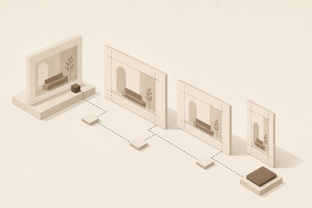
For furniture products feeding a room-compositing widget, aim for a minimum of 2,000 pixels on the longest side, rising to 3,000 pixels for large pieces like sofas and wardrobes where shoppers will zoom in. Shoot or source sRGB JPEGs for product pages, keeping PNG or WebP masters with alpha transparency for cutouts. The one rule that matters more than any spec: start with a high-resolution, clean packshot with accurate geometry and a consistent hero angle, because no amount of downstream processing rescues a poor original.
TL;DR:
- Use at least 2,000 pixels on the longest side for all furniture images, with 3,000 pixels recommended for large pieces requiring zoom.
- Capture packshots with a 70-200mm lens, fixed camera height, and consistent hero angles to ensure accurate proportions and avoid distortion.
- Export images in JPEG for backgrounds, PNG or WebP with alpha for cutouts, always working in sRGB color profile to ensure color accuracy.
- Create high-resolution, clean cutouts with proper masking, and check edges at high zoom to prevent halos and mismatched scale in room previews.
- Batch QA should verify geometry, color, lighting, and filename consistency across the full catalogue for reliability in compositing widgets.
Table of Contents
- What are the recommended WooCommerce product image dimensions?
- How do you capture a packshot ready for compositing?
- Removing backgrounds without losing detail
- Which export sizes do product pages, marketplaces and the widget need?
- How do you run batch QA across a full catalogue?
- What does the room-preview widget actually need from your images?
- What I'd prioritise if you can't fix everything at once
- Try the widget on your own product photos
- Sources
- FAQ
What are the recommended WooCommerce product image dimensions?
Furniture retailers preparing WooCommerce product image dimensions for a compositing widget need to think in terms of the master asset, not just the display size a theme happens to crop to. The master feeds everything downstream: your product gallery, marketplace listings, and the widget itself.
Platform guidance and practitioner recommendations for furniture photography consistently point to 2,000 pixels or higher on the longest side to support zoom and marketplace requirements. That's your floor, not your target.
| Use case | Recommended size (longest side) | Format | Max file size |
|---|---|---|---|
| PDP main image | 2,000–3,000px | sRGB JPEG | 500KB |
| Product gallery / zoom | 3,000px+ | sRGB JPEG | up to 2MB |
| Transparent cutout master | 3,000px+ | PNG or WebP (alpha) | uncompressed where possible |
| Marketplace main image | 2,000px minimum | JPEG (white background) | per platform rules |
A few format rules keep things simple:
- Use JPEG for any image that sits on a white or coloured background with no transparency requirement.
- Use PNG with alpha when you need a genuinely transparent cutout for compositing.
- Use WebP for delivery-weight savings once you've confirmed the widget or theme supports it.
- Always work in the sRGB colour profile — Adobe RGB masters shot on professional cameras will shift colour when displayed in browsers.
Compression is the part most teams get wrong. Export at a quality setting that still holds detail when you crop to 2x zoom on screen. If stitching or fabric weave turns to mush at that crop level, drop the compression ratio and re-export.
How do you capture a packshot ready for compositing?
Camera technique decides whether a room preview looks convincing or slightly "pasted on." Furniture has straight edges and predictable proportions, so any lens distortion is immediately obvious once the piece sits inside a photo of someone's actual living room.
- Set your focal length correctly. Camera guidance for furniture photography recommends a 70–200mm equivalent rather than a wide lens, which keeps proportions honest and avoids the barrel distortion that makes a sofa arm look swollen.
- Keep camera distance and height fixed across a product family. If you photograph three armchairs from three different distances, their relative scale will look wrong when a shopper compares them side by side in a preview.
- Choose one hero angle per product category and stick to it. A three-quarter front angle works for most seating; a straight-on angle suits shelving and cabinets.
- Light evenly. Neutral daylight or balanced studio lighting avoids the mixed colour temperatures that cause a fabric to read one shade in the packshot and another once composited.
- Frame with margin. Leave enough space around the product for cropping and for a natural contact shadow, and never let legs, arms, or handles clip the edge of frame.
- Shoot RAW or maximum-quality JPEG and check nothing is missing, no leg is cut off, and variant labelling matches the SKU before you move to the next item.
Pro Tip: Shoot a grey or neutral card alongside your first item of each session and check white balance before you shoot the full run. Correcting colour cast across 200 images later costs far more time than getting it right at the tripod.
Removing backgrounds without losing detail
Clean cutouts are where realism is won or lost, and thin legs are usually where it falls apart. Tapered wooden or metal legs, fringed upholstery, and semi-transparent materials like glass or acrylic all confuse automated background removal tools, leaving jagged edges or a faint halo around the silhouette.
Automated removal handles solid, high-contrast furniture reasonably well: upholstered sofas against a plain backdrop, painted cabinetry, most case goods. Fall back to manual retouching for anything with fine detail at the edge, glass elements, or busy patterned fabric where an algorithm struggles to find the true boundary.
A short checklist keeps quality consistent:
- Always preserve an unaltered master JPEG before you touch it, separate from the cutout file.
- Export transparent cutouts as PNG for guaranteed alpha support or WebP where your pipeline confirms alpha compatibility.
- Check the edge at 200% zoom for halos, colour fringing, or lost detail around legs and handles.
- Composite the cutout over a neutral room photo and check scale looks right, the contact shadow sits naturally under the base, and the seam where product meets floor reads as continuous rather than floating.
That last test matters more than any other quality check. A cutout can look flawless in isolation and still fail the moment it's placed into a real room, because floating shadows and mismatched scale are what shoppers notice first.
Which export sizes do product pages, marketplaces and the widget need?
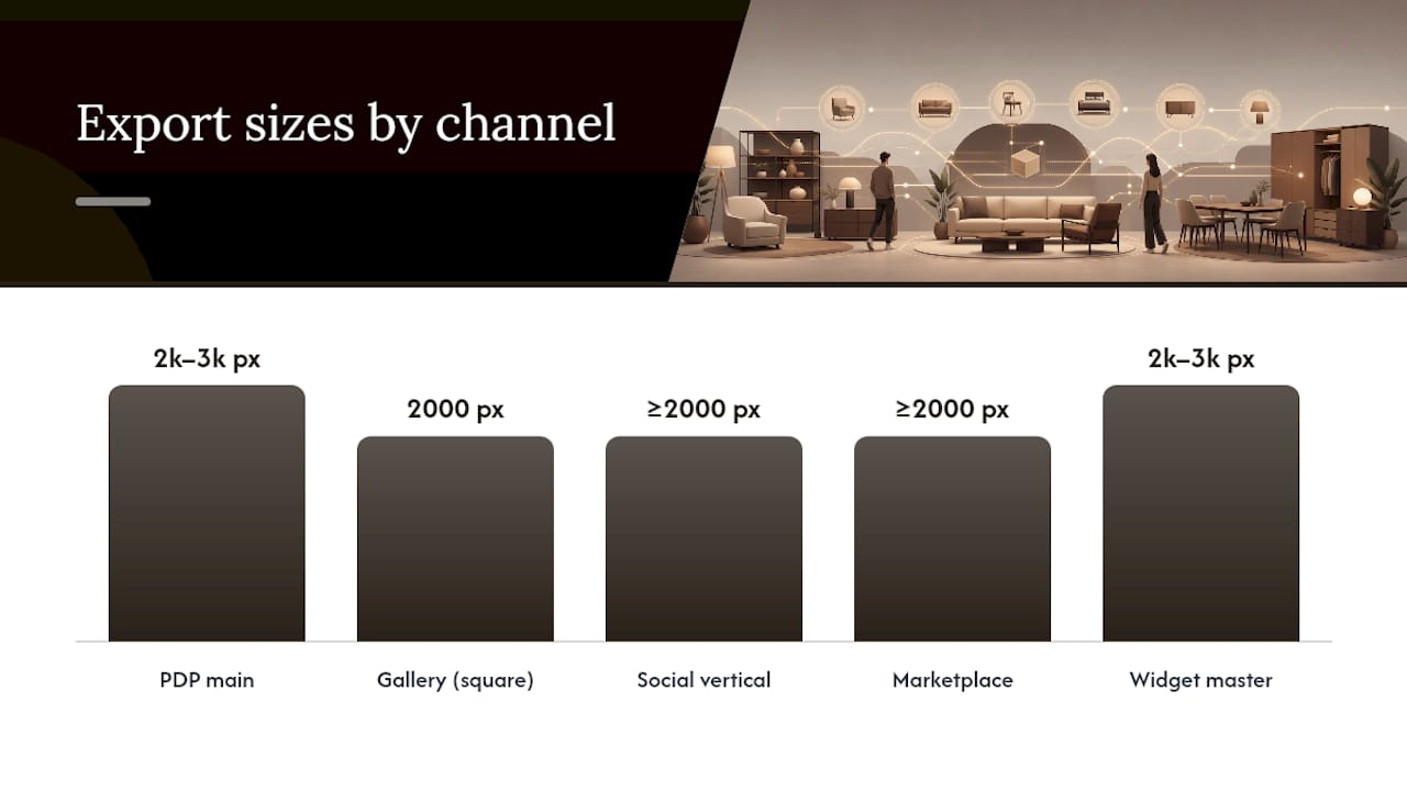
One approved master gets reframed into several channel-specific exports rather than reshot or re-isolated each time. That saves real production hours once you're working across a full catalogue, and it keeps every channel consistent with the same underlying geometry and colour.
| Channel | Recommended size | Notes |
|---|---|---|
| PDP main image | 2,000–3,000px longest side | sRGB JPEG |
| Gallery / square crop | 2,000 x 2,000px | Centre-weighted crop |
| Social vertical | 2000 pixels or higher | Platform-dependent |
| Marketplace main image | 2,000px minimum | Follow individual platform rules |
| Widget master upload | 2,000–3,000px longest side | WebP preferred where supported |
For the widget specifically, supply a medium to high resolution master rather than the smallest file that "looks fine" on a phone screen. Compositing engines need enough source detail to render a convincing scale and shadow, particularly on large furniture where the widget has to stretch or reposition the cutout against a shopper's uploaded room.
Naming convention prevents the chaos that creeps in once you're managing hundreds of SKUs. A structure such as PRODUCT_SKU_master, PRODUCT_SKU_packshot_RGB, PRODUCT_SKU_cutout_alpha, and PRODUCT_SKU_widget keeps every derivative traceable back to its source file, which matters enormously when a colourway gets updated six months later.
How do you run batch QA across a full catalogue?
Checking one image is easy. Checking three hundred without missing systemic errors is where most catalogue projects lose consistency, and it's why a fixed sequence beats an ad hoc glance at each file.
- Geometry pass. Confirm legs, armrests, and contact points look proportionally correct and haven't warped during background removal or resizing.
- Material and colour pass. Check fabric, wood finish, and metal tones match the product's actual colourway, since compression artefacts often shift subtle tones first.
- Lighting and shadow pass. Look for mismatched shadow direction, blown highlights, or a contact shadow that's gone missing entirely.
- Channel-crop and metadata pass. Verify each export hits its target dimensions and the file name matches your SKU convention before it goes anywhere near the storefront.
Practitioners run this same sequence, geometry, then material and colour, then lighting, locking a single hero angle per product family so variants stay visually stable when a shopper flicks between finishes.
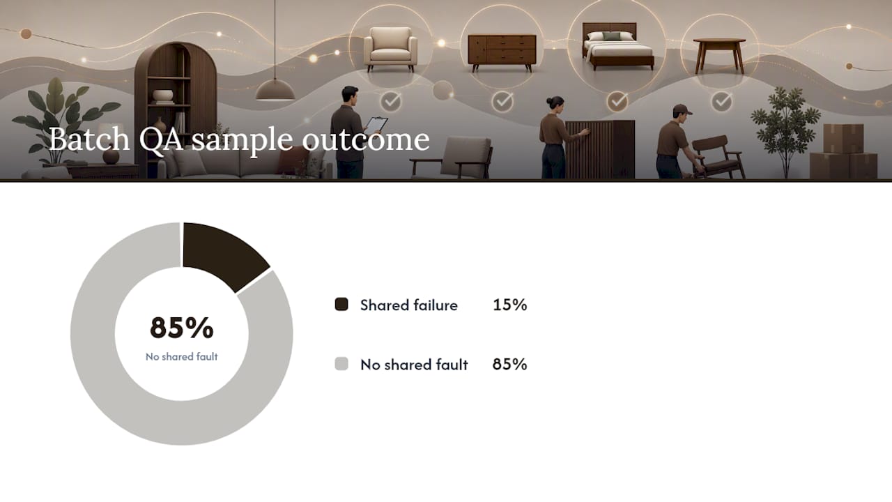
At scale, spot-check a sample rather than reviewing every file individually.
Pro Tip: Reject at the batch level, not the item level. If 3 of 20 sample images fail the same QA pass, stop and re-check the entire batch rather than fixing those three in isolation. The fault is usually systemic.
What does the room-preview widget actually need from your images?
A compositing widget is only as reliable as the input you give it. It expects a high-resolution packshot, a clean alpha cutout, consistent sRGB colour, and the same hero angle you've used across the rest of that product family. Feed it a low-resolution thumbnail or a cutout with a visible halo, and the preview will look obviously synthetic the moment it lands in a shopper's real room.
Keeping your original JPEG masters and clearly labelled cutout files speeds up processing considerably, because there's no ambiguity about which file is the source of truth.
Run a short bake-off before committing catalogue-wide: pick one hero SKU, upload the master packshot alongside its cutout, and inspect the result for scale accuracy, a believable contact shadow, and any colour drift between the product photo and the composited version. If that single SKU checks out, your capture and QA workflow is sound enough to scale.
What I'd prioritise if you can't fix everything at once
Fix your hero SKUs first. A handful of bestsellers with genuinely consistent packshots and a locked hero angle will outperform a full catalogue of mediocre images every time. Run your batch QA passes on those first, and don't let lifestyle photography substitute for a proper packshot. Room scenes are a supporting image, not a replacement for the clean master the widget actually needs.
— Michael
Try the widget on your own product photos
A room preview widget provides a direct route from your prepared packshots to a working room preview, without requiring reshoots or 3D modelling skills. It works from existing JPEGs in your product folder: a shopper uploads a photo of their own room, and furniture is composited into that space quickly, without app downloads.
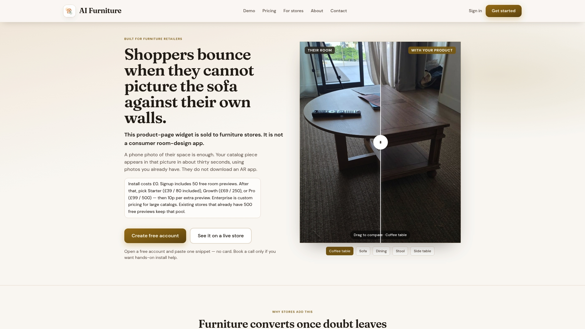
That matters because the alternative, building or licensing a full 3D asset pipeline, takes weeks and a specialist budget most furniture retailers don't have sitting spare. The free trial gives you 500 previews to test against your own hero SKUs before any cost applies, which is enough to run a proper bake-off across your bestsellers rather than guessing from a single test image. Take the master packshot and cutout you built using the steps above, run them through a live demo on your own product URL, and check the scale and shadow hold up before you roll it out catalogue-wide.
Sources
Further reading on product page image optimisation and AI furniture photography workflows covers related ground. Always check individual marketplace rules (Amazon, Google Shopping) before publishing, since minimum resolution and background requirements vary by platform.
- AI Product Photography a Guide for Furniture Brands | FurnitureConnect
- Stability AI — product photography
- How to Create Lifestyle Photos for Furniture — Pixii
FAQ
What is the minimum resolution for furniture product photos?
Aim for at least 2,000 pixels on the longest side, rising to 3,000 pixels for large furniture like sofas and wardrobes where shoppers zoom in more. Platform guidance and marketplace requirements commonly cite 2,000 pixels as the practical floor for zoom to work properly.
Should I use JPEG, PNG or WebP for furniture images?
Use sRGB JPEG for standard product page images that sit on a plain background, PNG with alpha for transparent cutouts you'll composite elsewhere, and WebP for delivery-weight savings once you've confirmed your platform supports it. Keep an uncompressed master of each file regardless of which format you publish.
Why does my room preview widget produce unrealistic results?
The most common cause is a low-resolution or poorly cut-out source image. Widgets like Aifurniture need a high-resolution packshot with a clean alpha cutout and consistent colour profile; a hazy edge or halo around the product is usually visible the moment it's composited into a real room.
How many images do I need per SKU for a compositing widget?
At minimum, one high-resolution packshot and one clean transparent cutout per hero angle. Workflow guidance suggests generating several scene variations and selecting the strongest two or three for publishing, rather than relying on a single untested render.
Does image size affect how fast my product pages load?
Yes. Oversized, uncompressed masters slow page load and hurt conversion, so publish appropriately compressed exports (JPEG or WebP at the sizes listed above) on the storefront while keeping the full-resolution master in reserve for zoom and widget processing.