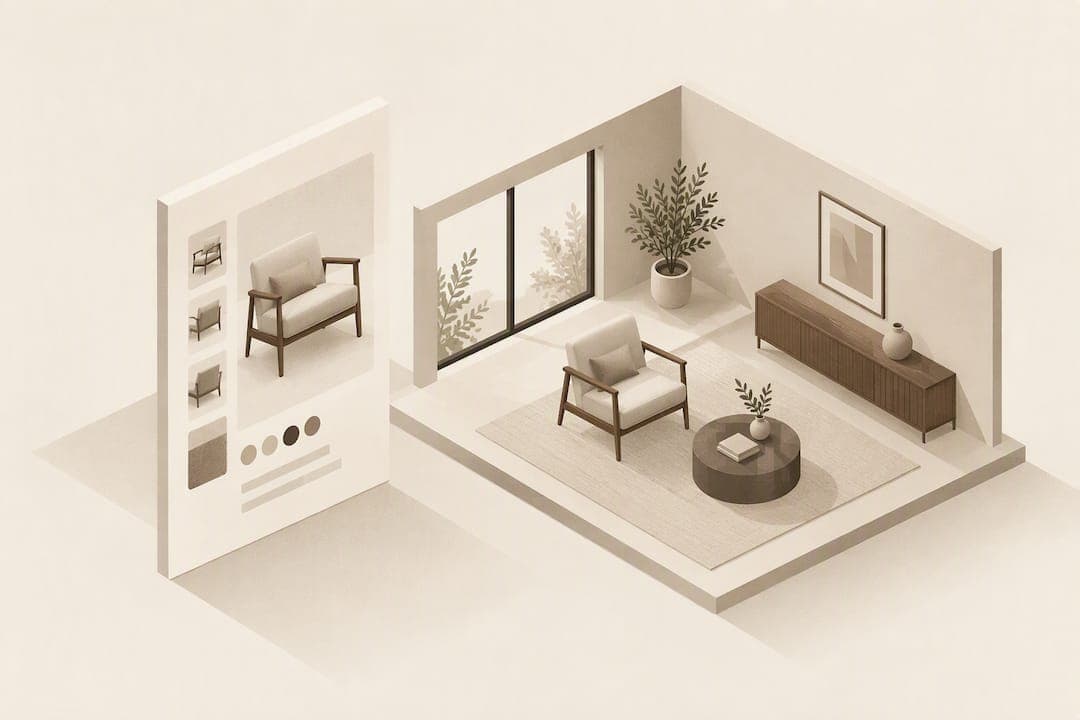
The best furniture product detail page puts media first, follows with a prominent buy box, places readable dimensions right beside it, and keeps delivery and returns information visible near the purchase controls. The two highest-impact fixes are a labelled dimensions image and upfront delivery transparency. Below we set out the practical rules and a short checklist for getting there.
TL;DR:
- Baymard found that 49% of furniture shoppers consider written dimensions essential, while 42% consider dimensions images essential, so place both near the buy box.
- Label every measurement directly on the product image, keep text legible on mobile, use consistent units, disclose manufacturing tolerances, and list dimensions for each variant.
- Show total delivery cost and the estimated date beside purchase controls; disclose return fees, the return window, and whether delivery is full service, threshold, or curbside.
- Test dimensions imagery and delivery transparency before investing in heavier visualization; compare conversion and product level return rates before and after changes.
- Photo compositing avoids app downloads and 3D assets; place previews beside the gallery and state that they take about 30 seconds to generate.
Table of Contents
- 1. Layout essentials: visual hierarchy and the buy box
- 2. Images and scale: product shots, in-scale and reviewer photos
- 3. Dimensions and measurements: written specs plus a dimensions image
- 4. Visualisation and fit tools: photo compositing versus AR
- 5. Delivery, returns and post-purchase confidence on the PDP
- 6. Mobile and accessibility: make measurements and media legible
- 7. Quick checklist: 8 practical layout fixes to implement now
- 8. Author perspective on trade-offs and testing
- How a room-preview widget can fit your product page
- FAQ
- Sources
1. Layout essentials: visual hierarchy and the buy box
The strongest furniture PDPs follow a predictable order: hero media at the top, a buy box immediately beside or below it, then specifications and dimensions within a short scroll. This ordering matters because shoppers decide fit and style confidence before they decide to buy, so the information that answers "will this work in my space" needs to sit near the information that lets them act on that answer.
A common mistake is burying specs, materials, or dimensions inside horizontal tabs. Baymard's research into furniture and home decor UX found that users frequently miss core content when it is tucked behind tabbed navigation rather than shown inline. Treat tabs as a last resort for secondary content, never for anything a buyer needs to decide.
Your buy box itself should show:
- Price, including any sale or financing framing.
- Stock status and lead time if the item ships from a warehouse or is made to order.
- An estimated delivery window.
- A single, unambiguous primary call to action.
Keep secondary actions (save, compare, share) visually subordinate so the primary purchase path stays obvious.
2. Images and scale: product shots, in-scale and reviewer photos
Furniture is hard to judge from a single hero shot because scale and texture rarely come through in isolation. A complete image set should include:
- A clean hero shot on a neutral background.
- A lifestyle image showing the piece styled in a room.
- An in-scale photograph, ideally with a person or familiar object for reference.
- Reviewer or customer-submitted photos where available.
- A shot of included accessories or hardware, if relevant.
Order images from hero to lifestyle to in-scale to reviewer content, so shoppers move from clean presentation to realistic context. Every image needs a caption and alt text that describes scale, material and any included items, both for accessibility and because screen reader users otherwise get no scale information at all.
Resolution matters more on furniture pages than most categories, since shoppers zoom to check grain, stitching and joinery. Make sure pinch-to-zoom works cleanly on mobile and that zoomed detail doesn't pixelate.
Pro Tip: Pair your in-scale photo with a short caption stating the model's height or the object used for reference, so the scale cue works even for shoppers who skip the image entirely.
3. Dimensions and measurements: written specs plus a dimensions image
Write dimensions in plain text near the buy box, and pair them with a labelled image that maps each number to the relevant part of the product. Baymard's furniture and home decor UX insights found that written dimensions are considered essential product content by 49% of furniture shoppers, with dimensions images close behind at 42%. Both formats matter because they serve different moments: text for quick scanning, image for spatial reasoning.

A labelled dimensions image removes the mental work of mapping a number like "84 inches" onto an actual sofa arm or seat depth. Baymard's guidance on dimensions images notes that this kind of visual mapping increases shopper confidence and reduces abandonment, particularly for items where a few centimetres decide whether something fits a room.
Embed the measurement labels directly into the image at a size that stays legible on a mobile screen without zooming. Include units consistently, note any manufacturing tolerance, and give separate measurements for each variant, since a sofa's depth can shift meaningfully between a two-seat and three-seat version.
4. Visualisation and fit tools: photo compositing versus AR
Many furniture retailers default to AR "view in room" tools, but Baymard's research found that shoppers often avoid these features because of reliability problems and the delay they introduce into the purchase decision. An AR tool that asks for an app download, a camera permission and a stable surface scan adds friction exactly at the point a shopper is close to buying.
Photo compositing is a lower-friction alternative: a shopper uploads a photo of their own room, and the product image is superimposed onto it without any app download or 3D model. We built our own widget around this approach for exactly that reason, using the product JPEGs retailers already have rather than requiring new 3D assets.
Where this sits on the page matters. A sensible placement is directly beside the gallery or just below it, before the dimensions block, so the shopper sees "see it in your room" as a natural extension of looking at photos. For implementation notes and platform coverage, see our overview for furniture retailers and the widget's Shopify integration notes. Practical points to cover on the PDP:
- State clearly that no app download is needed.
- Show how long a preview takes to generate.
- Mention supported platforms (Shopify, Magento, BigCommerce, WooCommerce and custom storefronts) if retailers ask.
- Keep the upload step to a single photo, not a scan.
5. Delivery, returns and post-purchase confidence on the PDP
Delivery cost and timing are primary purchase factors for furniture, not afterthoughts to surface at checkout. Baymard's quantitative UX insights identify delivery transparency, alongside dimensions, as a core part of the fit and purchase decision for furniture shoppers.
Show the full delivery cost and an estimated delivery date near the buy box rather than deferring both to checkout. Surface returns highlights before add-to-cart too:
- State any return fee and the return window in plain terms.
- Distinguish white-glove delivery from threshold or kerbside delivery.
- Link out to full logistics detail rather than cramming it into the buy box.
- Anchor a link to a longer returns FAQ for shoppers who want the detail.
Retailers working on this area may find it useful to see how returns policy presentation affects margin before rewriting these sections.
6. Mobile and accessibility: make measurements and media legible
Most furniture research starts on a phone, so the dimensions image needs to be legible at mobile width without pinch-zooming, and the buy box should sit within reach of the initial viewport rather than three scrolls down. Touch targets on the primary CTA need to be large enough to tap reliably, and focus order should move logically through gallery, dimensions, and buy box for anyone navigating by keyboard.

Alt text deserves the same care on mobile as desktop: describe scale, material, and included accessories so assistive technology users get the same fit information as sighted shoppers. ARIA labelling on price, stock status, and the CTA button helps screen readers announce the purchase-critical fields clearly rather than reading them as unlabelled text.
7. Quick checklist: 8 practical layout fixes to implement now
- Add a labelled dimensions image beside the written specs.
- Surface total delivery cost near the buy box.
- Add one in-scale photograph with a reference object.
- Move the buy box above the fold, beside the gallery.
- List included accessories and hardware explicitly.
- Write alt text that states scale and material.
- Resize embedded dimension text for mobile legibility.
- Add a lightweight room preview near the gallery.
8. Author perspective on trade-offs and testing
I'd test the dimensions image and delivery transparency first: they're cheap to ship and directly address return anxiety. Measure PDP conversion and product-level return rate before investing in heavier visualisation work.
— Michael
How a room-preview widget can fit your product page
A room-preview widget earns its place on a furniture PDP by removing the single biggest source of doubt: whether a piece will actually look right in the shopper's own space. Our widget does this through photo compositing rather than 3D modelling, so it works directly from the product photos retailers already have, generates a preview in roughly 30 seconds, and needs no app download from the shopper.
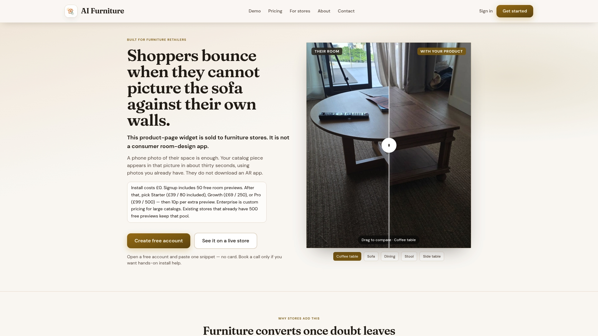
We offer 500 free previews to start, so a retailer can test the widget against real traffic before paying for additional usage. Beyond that, plans run from Starter at $52.56 per month through Growth at $92.99 per month and Pro at $133.42 per month, with Enterprise pricing available on request, all detailed on our pricing page. A sensible rollout:
- Place the widget beside the main gallery, just above the dimensions block.
- Track preview-to-cart rate and return rate on the SKUs where it's live.
- Compare return rates before and after launch on the same products.
See it running on a live page through our universal demo, or book a launch call to talk through integration on your platform.
FAQ
What is the 2/3 rule in furniture layout?
The 2/3 rule is an interior design guideline suggesting a piece of furniture, such as a coffee table, should be roughly two-thirds the length of the item it's paired with, like a sofa. It's a proportion rule for room layout rather than a PDP design standard, but it's worth mentioning on product pages that include room-styling advice.
Is there an app that will rearrange your furniture?
Several room-planning apps let shoppers drag and drop furniture into a virtual floor plan, though many require manual measuring or a room scan to set up. A lower-friction alternative on the product page itself is a photo-compositing preview, which superimposes a specific product onto a photo of the shopper's actual room without needing an app download.
How do I plan a furniture layout?
Start by measuring the room and the key pathways you need to keep clear, then confirm the dimensions of any piece you're considering against that space. Checking a product page for a labelled dimensions image, not just a list of numbers, makes this step far easier because it shows exactly which measurement applies to which part of the item.
What is the 70/30 rule in interior design?
It applies to styling a space rather than to how a product page should be structured.